The Lighting of Facades
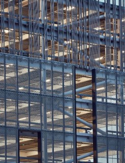
We’ve always been quietly fascinated by the use of lighting and relish the opportunity to integrate lighting into our facades. The Xero Building facade was designed to be lit from behind the fabric, making the building glow gently in total contrast with it’s daytime face. We thought it brought a new dimension to the building’s character and really showcased how lighting and the facade can combine to great effect.
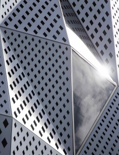
With dapple, the ability of a pattern to produce a changing choreography of light through to the building interior, can be mesmerizing and adds an aesthetic complexity to otherwise spartan interior spaces.
Another recent facade with integrated lighting, Alexandra Park apartments showcases the potential of using a custom dapple pattern in reverse, the solid white surfaces dominating the visual appearance in daylight but the colorfully lit apertures taking over at dusk . Doing so adds a distinct character to the building after dark that will seep into the subconscious of those that see it, marking the building as memorable.
Yes, lighting really is fascinating. Frank Loyd Wright was onto something when he said “more and more, it seems to me, light is the beautifier of the building”.
The Psychology of Lighting
It will come as no surprise that light is linked to emotions. Or more accurately, lighting can act as a stimulus which can trigger emotions, usually because of some context within our memory which comes rapidly to the forefront of our minds. For example, if we see blue and red flashing lights when driving, we usually know it means we’re in trouble or someone else is (we just normally hope it’s the latter). But what about lighting and architecture? Could lighting change the way we perceive a building or a space and elicit an intended emotional response?
The most well known lighting expert in this area (to us anyway), is John Flynn. His pioneering work in ‘Lighting Psychology’ and research informs much of what we know today and he was the first to really study and document human responses to lighting.
Flynn was able to link changes in lighting to changes in our impressions of the architecture. That is, he showed how changes in lighting might lead us to change our perception of spaciousness, visual clarity, privacy, pleasantness, relaxation and complexity.
He took it further too, identifying the ‘lighting modes’ that sit on a continuum and can be adjusted to alter our impressions. These are; bright/dim, uniform/non-uniform, central/perimeter, warm/cool. By adjusting each of those light modes, Flynn stated it was possible to reinforce certain impressions. For example, uniform lighting on the perimeter reinforces an impression of spaciousness.
Of course, it seems it’s not as simple as turning the lights up or dimming them. The environmental psychologists, Kaplan and Kaplan, suggest there has to be some coherence to what is being illuminated. That is, as we seek to make sense of the environment around us (which is basic human nature) if lighting is used to highlight something unimportant it will serve to disconnect and discombobulate, therefore reducing any likelihood of appeal.
Linking emotions to lighting and vice versa may sound like a fringe thing but there must be something to it. In a short video on the amazing facade at the Allianz Arena in Munich, Roger Karner (GM, Phillips lighting Germany) says this; “We have demonstrated that we can do more than merely provide color with our illuminations. We can also convey emotion. Football is emotion and emotion is light”.
We tend to agree. Working with lighting and facades, we have seen the changing response on people’s faces when viewing our work in the day, then at night.
Facade Lighting Considerations & Techniques
Accepting the above holds water (and there really is no reason to believe otherwise) it’s quite fascinating to note this is really just the beginning. And as we’re really trying to resist making puns about how illuminating all of this is, we shall swiftly move on…
In addition to tinkering with the lighting modes, there are some decisions to be made around whether the lighting techniques should be uniform (as in equally dispersed floodlight style), localized (thus taking into account Kaplan & Kaplan) or hidden. Of all of these techniques, hidden illumination is arguably the most complicated but can achieve some quite astounding dramatic effects when executed well.
There are other considerations too. Should the lights be direct and shine on the facade itself? Then there’s something known as ‘grazing’, where the light fixture is placed close to a vertical surface (usually the bottom) and shines upwards, where it gradually fades. If the facade has particularly interesting and intricate detailing, accentuating lights might be used.
The Influence of Building Function on Lighting
One of the interesting aspects of lighting we’ve been keen to observe is how the function of the building influences the choice of lighting technique employed, and how this links to the emotional response and influencing impressions.
We’ve worked on a number of libraries, including the recently completed Te Ara Atea at Rolleston Town Center, designed by Warren & Mahoney. The lighting is welcoming and elegant. Indeed, the design is such that the clever use of concave louvers uses light, reflection and shadows during the daytime to an amazing effect. Yet Hospitals, like Burwood, are something else. Quite understably, the lighting is primarily functional and designed to illuminate the grounds and surrounds, so people can navigate to the building easily.
Hospitality buildings have a tricky balance to pull off. They need to be bright to attract attention whilst simultaneously appearing to offer a relaxed atmosphere inside. Maybe this is achieved through the use of color and neon on the exterior to make the building grab your attention, whilst the light coming through the windows is yellow and warm. Between the two is a gap for contrast, allowing each to become more emphasized. Imagine walking through the snow and seeing that flashing neon ‘open’ sign for a bar, next to the window which shows people enjoying the warmth inside, coats off, drink in hand and smiles on their faces. It would be hard to resist.
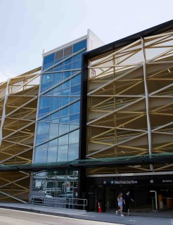
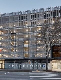
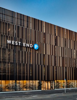
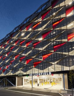
Then there’s car parks. Brightly lit on the inside for safety reasons, from the outside their appearance can be almost anything, such is the beauty of working with a black canvas of such scale. So we get these wonderful designs like the Les Mills Car Park, which practically sparkles at nighttime. Or the Litchfield Street Car Park that uses light, shade and color in geometric patterns to turn a car park (which is fundamentally a rather brutal shape) into something visually appealing that enhances the immediate area.
Our Work Up in Light
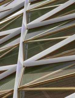
With dapple, we manipulate natural light to create a changing ambience and mood for building interiors.
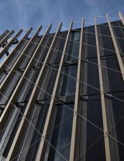
When we introduce light behind our facades, we’re adding texture and another layer to the character we’re trying to establish. It’s a more grandiose show and by using different variations of backlights, or even directly lighting the facade itself, the exterior can take on a different appearance which shifts to suit the natural light available. So by night, the facade comes alive with an evening mood. By day, it uses the sun to highlight and accentuate design elements.
Which all sounds very complicated. Still, it is worth it to see our facades up in lights.

