The Use of Patterns in Facades
There’s something appealing about patterns and it’s relatively normal to see them in the stars, in the lines of buildings, cracks in the pavement, or anywhere there’s a seemingly repeatable occurrence of shapes and lines. We’re wired to notice them and research suggests it’s all part of the natural learning process, so we tend to seek patterns subconsciously.
Just because we can see patterns everywhere doesn’t mean we shouldn’t use patterns in facades though. In fact, it’s quite the opposite. We should use them and there are a few well proven reasons why.
Neuroscience and Facades
One of the most consistent findings in Neuroscientist's Colin Ellard’s study into the psychological impact of design is that people are strongly affected by building facades. Which seems obvious really. We like things that are nice and we dislike things that are not nice.
Obvious it might be, but this didn’t stop Minoru Yamasaki from designing the 33 featureless blocks of the Pruitt-igoe housing complex in St Louis, Missouri. The effect the design had on the residents is legendary and it serves as a prime example as to how designs can impact the happiness of people.
If the Pruitt-igoe housing complex serves as a warning, so does this rather blunt quote from Charles Montgomery, from in his book, Happy City:
“As suburban retailers begin to colonize central cities, block after block of bric-a-brac and mom-and-pop buildings and shops are being replaced by blank, cold spaces that effectively bleach street edges of conviviality”.
Which brings forth another quote, this one from no other than Winston Churchill; “we shape our buildings and afterwards our buildings shape us”. All of which is to say, facades are important, design is important, and therefore…using some nice patterns in facade design must be important too.
Anyway, you can see the pattern here. There’s a relationship between the facade and the people exposed to it.
Type of Patterns
Trying to describe all of the possible patterns you could put on a facade is way beyond the scope of this humble blog. For example, there are a countless number of patterns in maths. Well, there’s actually 3 main ones at last count. Either way, we’re not talking paint-by-numbers here so they’re a little (but not completely) irrelevant.
Nature has 9 main patterns; symmetries, trees, spirals, meanders, waves, foams, tessellation, cracks and stripes. Of these, trees might be the most interesting as an example of a fractal pattern.
The term ‘fractal’ was introduced by Benoit Mandelbrot in 1975 after he discovered that mathematical rules apply to a vast number of patterns that are unusually complex. Maths really does count in all parts of life then. That’s not what’s interesting here though (at least we don’t think so). What’s really interesting is the effect fractal patterns have on us humans.
According to Psychology Today, fractal patterns can reduce stress by up to 60%. No doubt, a good portion of the stress-busting ability of fractal patterns, which is usually found in nature, comes from the context of their setting. Yet research indicates artwork with fractal patterns can promote relaxation too.
Whilst not exactly a fractal pattern, it would be easy to assume the custom dapple design at Windy Ridge School will have a relaxing effect on the students. Obviously not enough to make them drowsy in class but just enough to turn the teen angst down a little.
Whatever the pattern developed, a few natural assumptions seem to hold water. For example, if a pattern has soft angles and gentle curves, it’s generally considered to be welcoming and friendly. Indeed, just look at the language we use to describe the pattern; soft angles and gentle curves. We know the reader will instinctively know what this means. Whereas if we say harsh angles, it conjures images of sharp turns and lines that are bold and almost angry.
So if patterns can be used for good - just how do we do it? Unsurprisingly, we have a few ideas here…
How to Display Patterns
Now we’ve convinced you on the value of patterns (we’re assuming and hoping here), the next step is to decide how to display a pattern. There’s a few options and some are ready to specify right now.
dapple Range
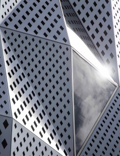
The standard dapple range features a number of repeating patterns with a variation in open area and shapes to suit. Patterns such as ‘daylight’, ‘twilight’, ‘sunrise’ and ‘sunset’ provide a ready-made solution that can be finished in a number of powder coat colors. Every pattern has been wind tested to mitigate wind-induced noise issues and can be adapted to suit a specific project.
Picture Perf
For a highly differentiated aesthetic, picture perf can be developed to produce recognizable, photograph-like images through a unique arrangement of hole size and density. The opportunities from this method are unique and arguably underused in design. For a building in need of renovation, picture perf is a cost-effective method for breathing some fresh life that brings it up-to-date and makes it more attractive for tenants.
Bespoke Facades
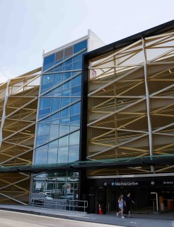
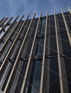
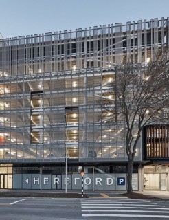
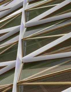
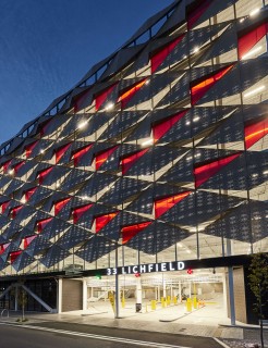
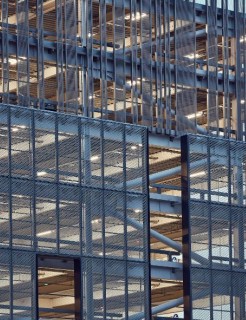
Aluminum is one of the most adaptable materials and is easily paired with others for dramatic effect. Litchfield Street Car Park is a prime example, using diamond shaped scales with translucent acrylic panels, to create a stunning pattern. The aesthetic changes during any given 24 hours, with light and shade casting shadows inside and adding angular shadow lines on the exterior that compliment the triangular design.
Patterns really are everywhere and when it comes to facades, the use of patterns has a proven appeal that can add to almost any building. It’s easy and straightforward to do, and
something we see time and time again in our work. Yes, there’s a pattern to our work with patterns. At least we think there is. It’s either that or we’re suffering from apophenia.

